BELIGHT
Belight is a skincare brand that focuses on its natural ingredients. They envisioned a natural skin care product to be accessible to everyone at their very doorstep. They have first launched their products in Mid-2020 but then decided to rebrand their logo in 2021 to better reflect their vision.
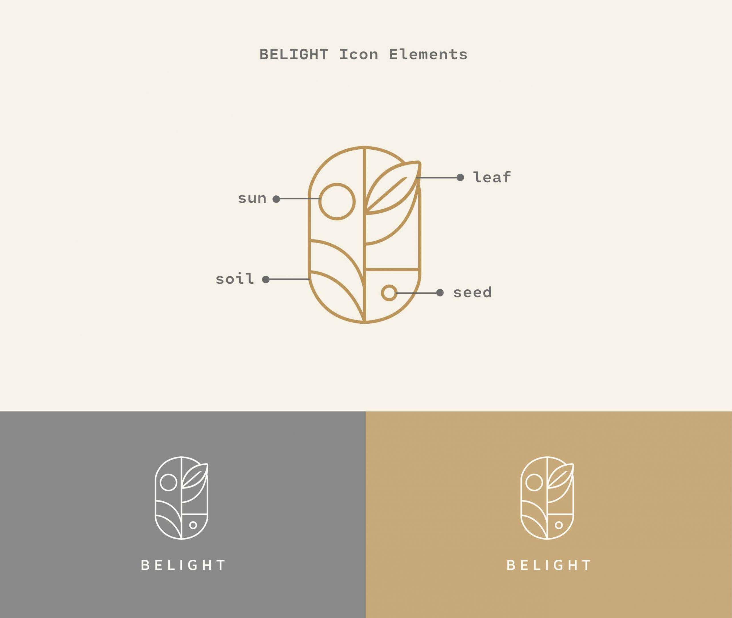
Thus, Studio Damara approached this project by trying to elaborate on its natural and organic elements and we came up with an abstract icon to represent the brand. The brand itself contains 4 elements, which are the sun, leaves, soil, and a seed. Through these elements, we want to remind all Belight customers that they are all part of this beautiful ecosystem, just like our nature.
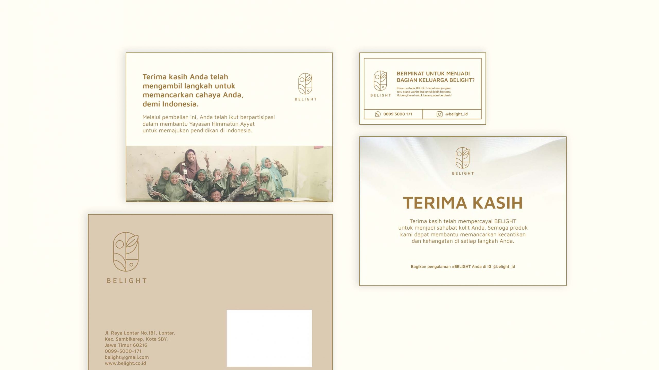
As a brand itself, Belight strives to give impact through its business. For every product purchased, they are giving back to an education organization in Indonesia, namely Yayasan Himmatun Ayyat. The same as Belight icon that tells a story of the growth of a small seed that will be a part of a bigger ecosystem, Belight, and all Belight customers wish to be a greater impact than just our surroundings.